


Introduction
I had the opportunity to create an illustration for the "Włocławki on the shirts" competition, which was organized by Włocławek city and the contemporary art gallery in Włocławek. My project was awarded in the contest and exhibited in a contemporary art gallery in Wloclawek.
The purpose of the artwork is to promote Włocławek and faience (a kind of ceramics with characteristic patterns).
See how these classic products look like, hundreds of years of history are locked in them:
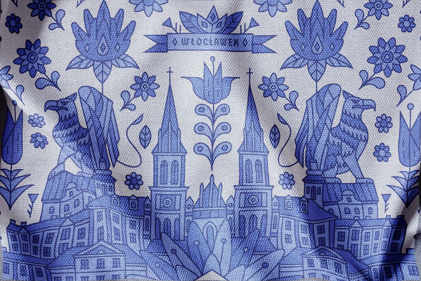
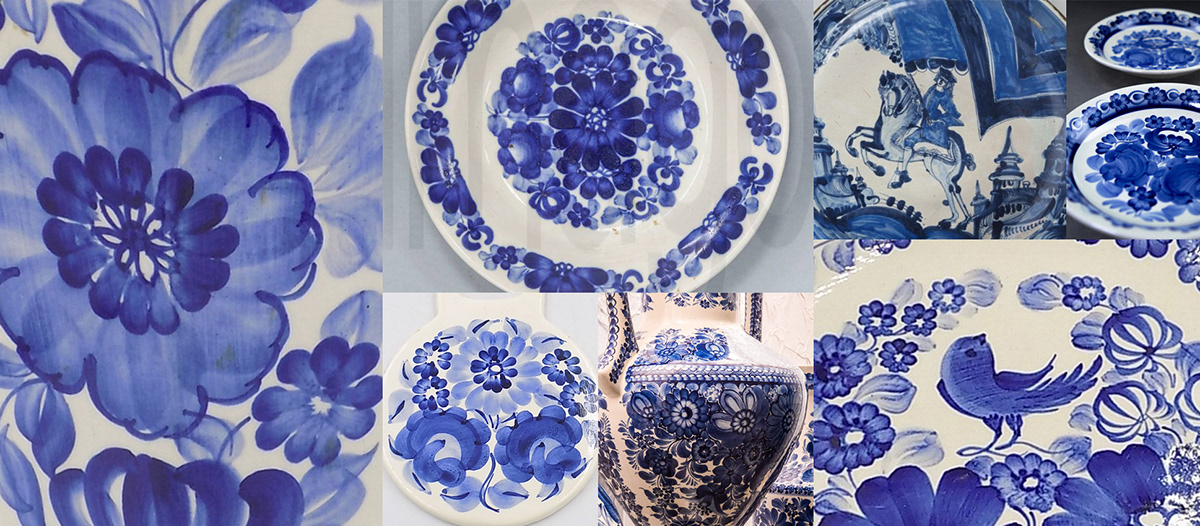
Włocławek is where the one of largest faience factory in Poland is located. It was established almost a hundred and fifty years ago. By painting unique patterns, they made works of art out of normal plates.
The city appreciates the faience tradition.
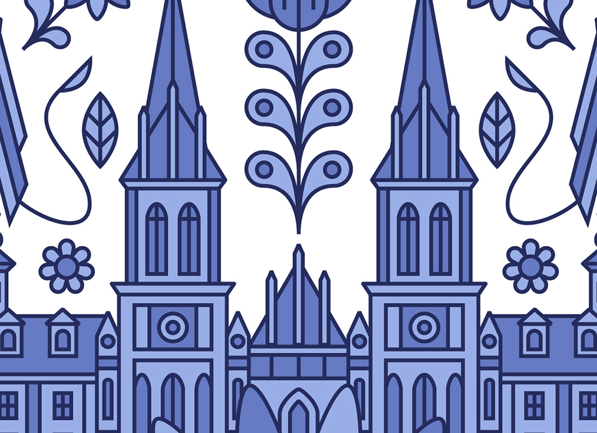
In my illustration I included references to the city, history, monuments and faience paintings.

Sketch
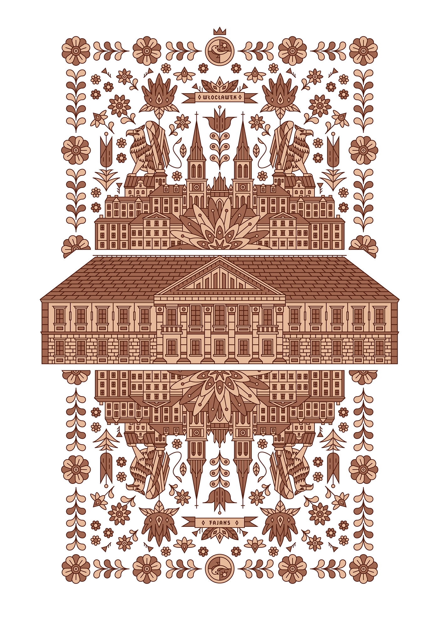
At first, I had the idea of presenting one of the most famous monuments that you can find in Włocławek - the Amber Palace with its characteristic flowers in the background. Once I had it, I could add more elements.
The pattern was much less complicated at first, but it took a different path. It has become much more detailed.
First, I placed the basilica behind the flower. Then an avalanche of ideas flooded me. Since this moment composition evolved really quickly. I added another monument - the Church of John the Baptist. I enclosed everything with Włocławek tenement houses.

I went higher and higher, adding more flowers and details. Paradoxically, this was where the challenge was greatest. I wanted to keep the illustration in a geometric style and at the same time create interesting flower shapes. I experimented for hours, tested many flower variants to finally come to the ones that work well with the whole illustration.
In the meantime, I readed the legend of the griffin from Włocławek (When establishing the settlement, a griffin was met, who agreed to protect the city and its inhabitants. As a sign of gratitude, a griffin was placed in the town's coat of arms)
I decided to include the Griffin in the project. It fits perfectly into the compositions.
I made a few small adjustments and found the sketch finished.

Shape and form
Here I interpret my own sketch. I wanted to keep the harmony and geometric form, so precision was the key.
At the same time as the illustration, I was building a grid. I didn't think about it when I placed more objects. I was constructing it as a curiosity. Optionally, I could use it for minor adjustments
Using a grid in an illustration is a rare thing. It is rare to find illustrations in which the grid makes sense. On the other hand, using the grid in illustrations is an interesting experience. I think in this case the grid can be helpful. You just have to remember not to become a slave to it and sometimes run away from it.
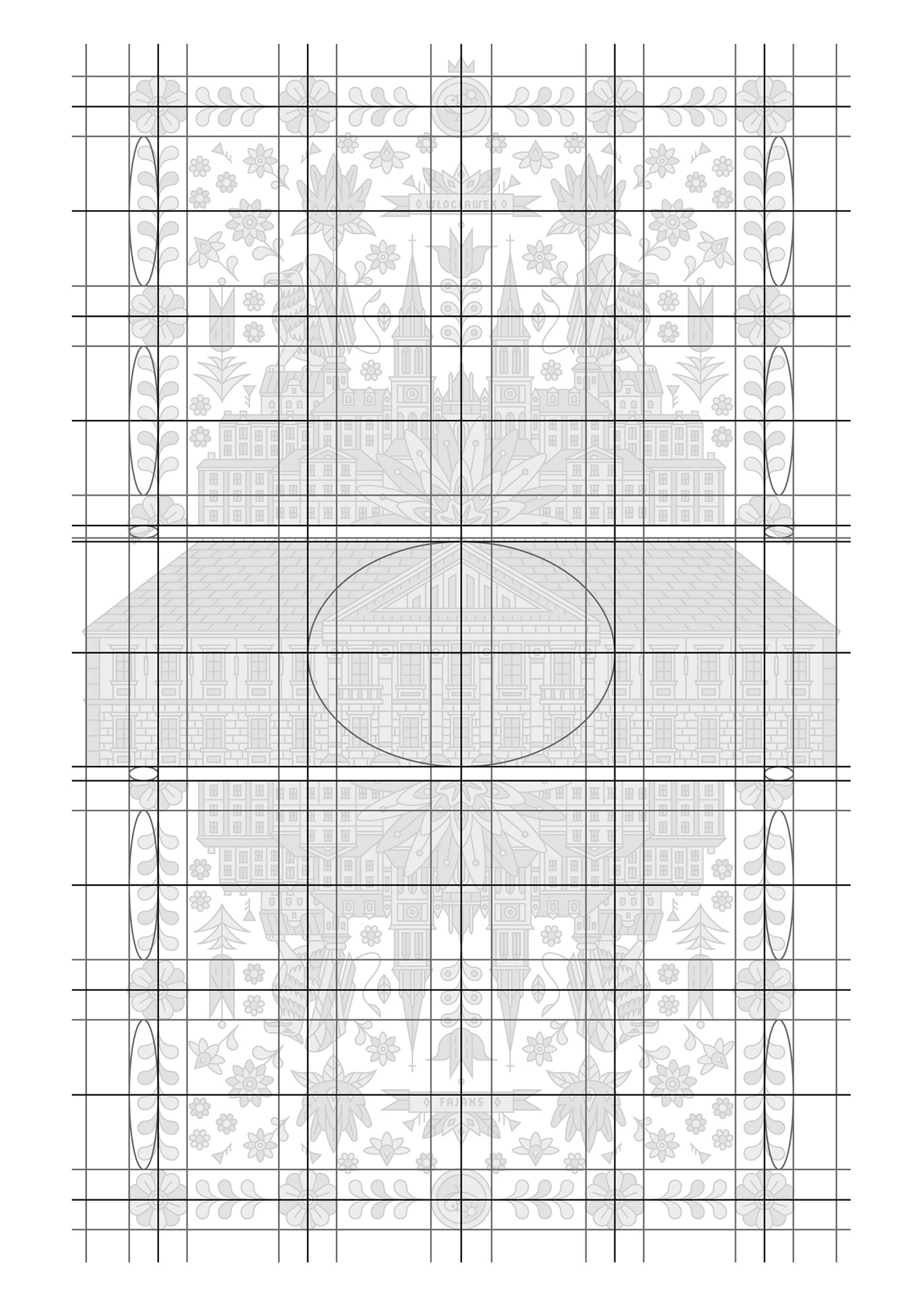
It is very important for me to focus completely on shapes. This is the reason why I am working in black and white or with outline at this stage.
I don't care about colors. I just think if the element should be light or dark. I focus entirely on composition and shapes.
simplified Griffin wings was difficult thing. I went back to the sketch and started dropping the concept versions of the wings onto the paper. When I see potential in a concept, I import it into illustrator and check it. I check over and over again.
Ah, I almost forgot. I also added a classic bird (This often appears on Włocławek's faience).


Colors
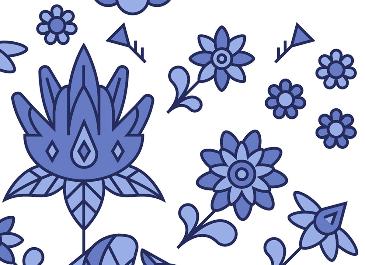
The most important thing was a strong reference to the faience colors. You've probably noticed that blue is the most used one. In this situation, blue is iconic. I could choose a lot of directions, but I knew the illustration was doomed to monochrome blue.
I did the second version. It is also based on the colors of the plates. However, the pressure of the blue, was too much to get out of it. As a result, the second version may only be an add-on.

In fact, my job on this stage was simple. I just wanted to find the best values for blue. I have been looking for a long time for a good proportion between the colors on the plates and the colors that looks good on the screen.
When I uploaded the illustration to the mockup, I began to wonder if it should cover the entire surface of the T-shirt. I tested many variations, scaled, cut off the mirror image. After that, I came to the conclusion that I would use the initial idea. To be honest, I was a little afraid at this stage, because T-shirts with a large pattern are unlikely to be in fashion, but on the other hand when I reduced the frame it lost legibility
At this point I would like to thank Anthony Boyd for a superb free mockup.

Details
As you can see, I tried to create an illustration that you can explore. You look at it and you keep seeing something new. You look for more details. Being able to explore is very important to me, it's my favorite part of any artwork.
Even when you don't want to explore, you feel all those details. You don't be aware of them but you feel them.
Here are a few:


Labels
I extracted several objects from the illustration (one for one size) and made them into minimalist labels.
I adore such small things as having a different object on each size label. Such labels are printed individually anyway, so why not take advantage of that? It gives the product a bit of a limited feel. Everyone likes to have something limited, so when we talk about marketing, such choices are obvious.
On the reverse side I put a short story of the faience factory in Wloclawek.


Thanks
After that, I completed the illustration for the contest. I would like to thank the Włocławek city and the contemporary art gallery for giving the field to work on it. I really like artworks in which I can relate to so many things.
Thank you for reading. I hope you found it interesting.
If you want to find out more about faience, you can take a look here:


